
Color System
The complete color foundation of Create UI. Built on the full Tailwind CSS palette, with primitive colors and semantic tokens that stay in sync between Figma and React.
Overview
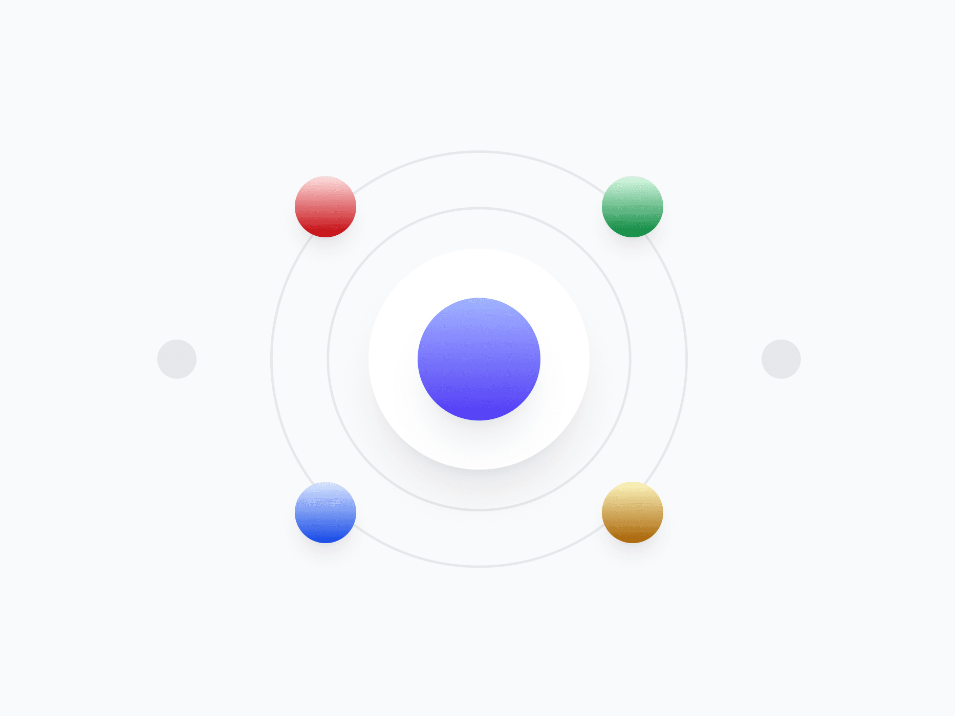
The Color System is the foundation behind every visual decision in Create UI. It's built in two layers: primitive colors from the full Tailwind CSS palette, and semantic tokens that reference them. Components only use semantic tokens, so the system stays consistent, themeable, and easy to refactor across Figma and code.
Figma Preview
When should you use them?
Use the color system any time you set a background, text, border, or state color. Instead of hardcoding hex values or reaching for raw primitives, reference semantic tokens so your interface stays consistent and updates system-wide when a color changes.
How should you use them?
- Reference semantic tokens like primary, surface, or text-muted in components, never raw hex or primitive values.
- Treat primitive colors as the source layer only, semantic tokens are what you actually apply.
- Reserve the primary color for key actions and emphasis, not decoration.
- Keep text and background contrast at WCAG AA minimum, the Tailwind palette is built to support this.
- Switch between light and dark mode by changing the theme variable, not individual colors.
Stop deciding.
Start shipping.
The system is ready. Free to start, or get full access
at 50% off before the price goes up.
Start Free Now.
Upgrade whenever you need.


