
Spinner - Loaders
The loading indicator of Create UI. Spinner offers 12 variants, 3 appearance styles, and 4 sizes, working standalone as a page loader or embedded in buttons and inputs, ready in Figma and React.
Overview
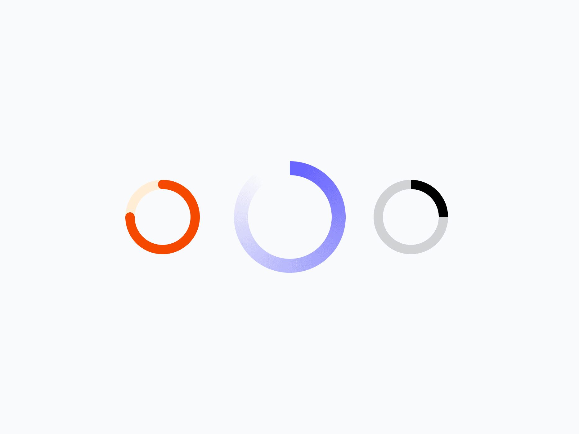
Spinner is the loading indicator of Create UI. With 12 semantic variants, 3 appearance styles, 4 sizes, and 2 arc lengths, it gives precise control over visual weight and motion. Use it standalone as a page or section loader, or embed it directly into buttons, inputs, and other components as a loading state.
Figma Preview
When should you use them?
Use a spinner to signal that something is loading when the wait is short and indeterminate, like a page or section loading, or a button waiting on a request. When you can show how much is left, use a progress bar instead, and for content placeholders, use a skeleton.
How should you use them?
- Use a spinner for short, indeterminate waits; use a progress bar when you can show how much is left.
- Embed a small spinner in buttons and inputs to show their loading state.
- Use a larger spinner standalone for page or section loading.
- Hide the track background when the surrounding component already provides structure.
- Pair the spinner with brief text for longer waits, so users know what's happening.
- Give the spinner an accessible loading label so screen readers announce the wait.
Stop deciding.
Start shipping.
The system is ready. Free to start, or get full access
at 50% off before the price goes up.
Start Free Now.
Upgrade whenever you need.


