
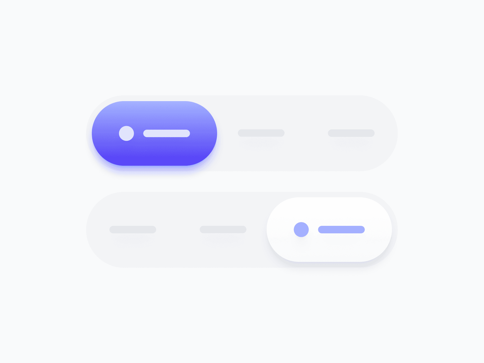
Segmented Control
A compact selection component for switching between a fixed set of views, modes, or filters. Segmented Control offers 2 variants, 5 sizes, and 2 to 5 segments, ready in Figma and React.
Overview
Segmented Control is a compact selection component for switching between a fixed set of views, modes, or filters. With 2 variants, 5 sizes, and flexible segment counts from 2 to 5, it's the go-to choice for tab-like navigation, view toggles, and option switching within a single content area.
Figma Preview
When should you use them?
Use a segmented control to switch between a small, fixed set of mutually exclusive views or modes, like List vs Grid, or Day, Week, and Month. Keep it to 2 to 5 options where all choices fit comfortably and stay visible at once.
How should you use them?
- Use a segmented control for 2 to 5 mutually exclusive options that all stay visible.
- Use a select instead when there are too many options to show at once.
- Keep segment labels short and parallel so the control stays compact and scannable.
- Show the selected segment clearly so users always know the current view.
- Use Icon Only mode in tight toolbars where text labels aren't needed.
- Keep segments keyboard-navigable with arrow keys, like a native tab set.
Stop deciding.
Start shipping.
The system is ready. Free to start, or get full access
at 50% off before the price goes up.
Start Free Now.
Upgrade whenever you need.


