

Icons
2,800+ Remix Icon icons in Line and Fill styles for React and Figma, organized into 25+ categories and free for personal and commercial use.







Loved by 2,000+ users worldwide.
Overview
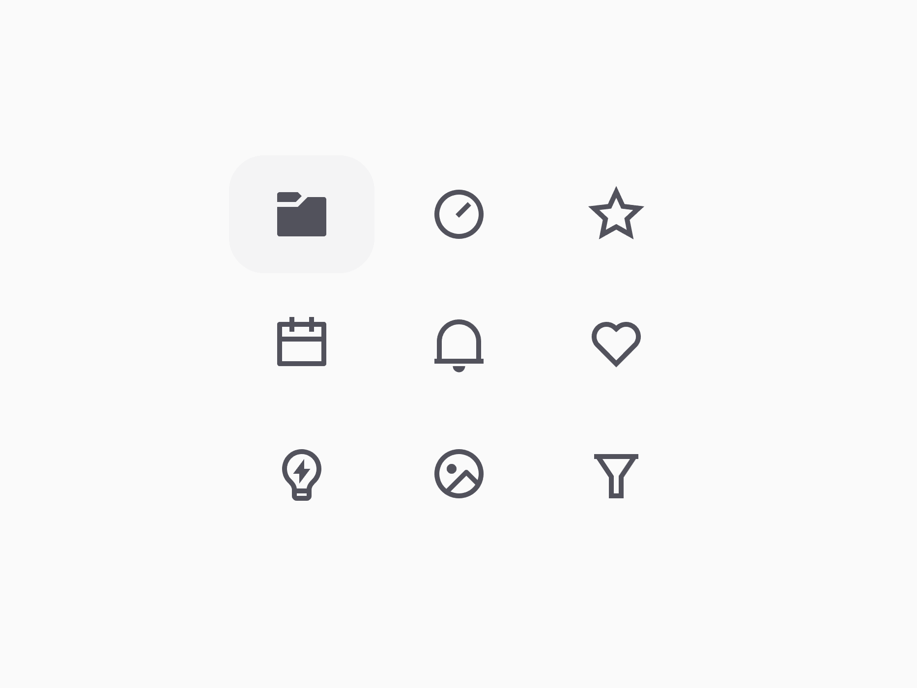
Icons in Create UI come from Remix Icon: 2,800+ icons, each in a Line (outline) and a Fill (solid) version, organized into 25+ semantic categories like Business, Design, Logos, and System. The Figma library tracks Remix Icon 4.9.1, and the icons ship as React components in the @create-ui/assets package. Every Create UI component sizes them for you through its leading and trailing props.
Figma Preview
When should you use them?
Use icons to support actions and labels: buttons, menus, inputs, badges, navigation, and empty states. Use Brand icons for companies and products, and Country Flags for regions.
How should you use them?
- Import icons from @create-ui/assets/icons, for example RiSearchLine, instead of adding another icon package.
- Pass icons through a component's leading or trailing prop, and let the component set their size.
- Use Line by default and Fill for active or selected states, so the two styles carry meaning.
- Give an icon-only button an aria-label so the action has an accessible name.
- Remix Icon License v1.0 lets you use the icons in personal and commercial work, but not resell them as a standalone pack.
Questions,
answered clearly.
Plans, pricing, licensing, updates, and technical questions, all answered in one place.
Still have questions?


Your current plan is a one-time payment, no subscriptions, no recurring charges for what you buy today. Some future Create UI products (such as AI-powered features) may be offered as optional add-on subscriptions, but these are entirely separate and will never affect your existing purchase. What you buy now, you own permanently.

Stop deciding. Start shipping.
Install it today and your next screen takes an hour instead of a day. Keep rebuilding from scratch, and next quarter looks exactly like this one.
Start Free Now. Upgrade whenever you need.



