

Step Indicator
A complete family for multi-step progress. Step Indicator offers 4 components from full onboarding flows to minimal dot trackers, ready in Figma and React.








Loved by 2,000+ users worldwide.
Overview
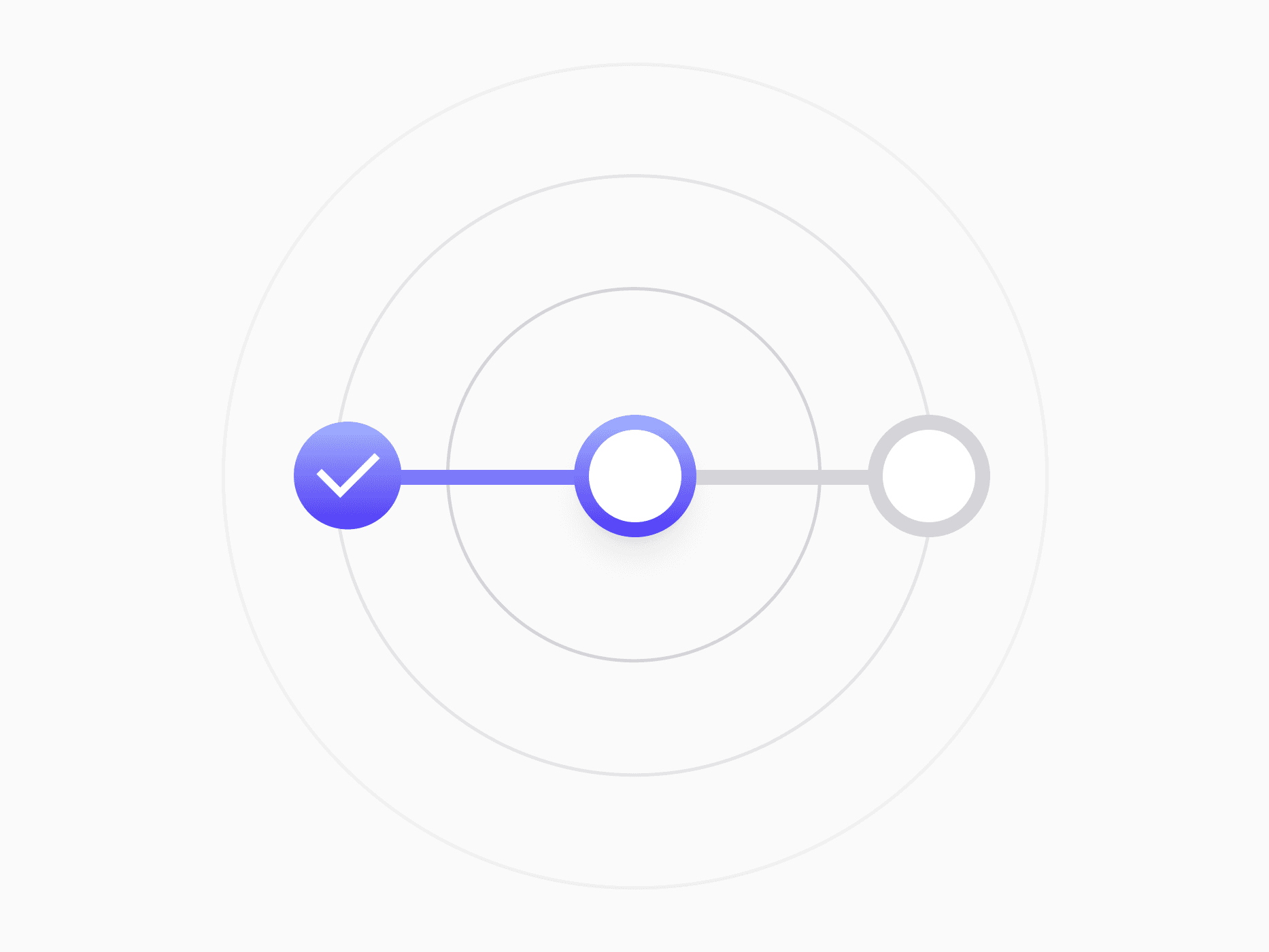
Step Indicator is a four-part family that walks users through any multi-stage process. The full Step Indicator carries complete step descriptions with inline CTAs at every stage, Step Indicator Compact condenses the journey into a single numbered row, Step Indicator Badge renders each stage as a tappable navigation chip, and Stepper Dot reduces progress to its lightest form, a row of dots with the active one stretched into a pill. All four share the same Active, Completed, and Locked state language and the same internal building blocks.
Figma Preview
When should you use them?
Use the step indicator family for any journey with distinct stages: account setup, onboarding flows, checkout, settings wizards, and carousel sequences. Reach for Progress Indicators when you are showing completion of a single task rather than position in a flow, Pagination when users browse content pages in any order, and the number input Stepper when the job is entering a value, not tracking progress.
How should you use them?
- Pick by density: the full Step Indicator when steps need descriptions and CTAs, Compact for form tops and modal headers, Badge for wizard sidebars where steps are navigation targets, Stepper Dot when users only need step X of Y.
- Toggle the optional step items to match the flow length instead of detaching, from 2-step quick flows to 6-step onboarding (up to 5 for dots).
- Keep the state language consistent: Active gets the brand highlight, Completed gets the check, Locked stays muted and never accepts entry.
- Place the Continue button and Skip for now link only on the Active step, and let them inherit button and badge tokens rather than styling locally.
- Make Completed steps tappable so users can revisit and edit earlier stages, and keep Compact labels to one or two words.
- Render steps as an ordered list with aria-current='step' on the active stage, and pair color with icons like the check and lock, so state never depends on color alone.
Questions,
answered clearly.
Plans, pricing, licensing, updates, and technical questions, all answered in one place.
Still have questions?


Your current plan is a one-time payment, no subscriptions, no recurring charges for what you buy today. Some future Create UI products (such as AI-powered features) may be offered as optional add-on subscriptions, but these are entirely separate and will never affect your existing purchase. What you buy now, you own permanently.

Stop deciding. Start shipping.
Install it today and your next screen takes an hour instead of a day. Keep rebuilding from scratch, and next quarter looks exactly like this one.
Start Free Now. Upgrade whenever you need.



