
Modal / Dialog
The complete modal system for confirmations, settings, notifications, and multi-step flows. Modal combines a header, body, and footer into one composed structure, ready in Figma and React.
Overview
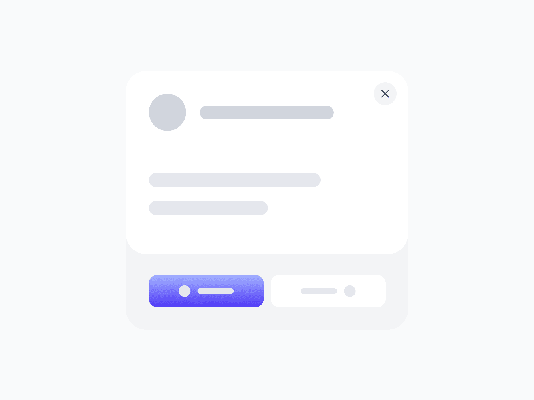
Modal is the complete overlay system for focused tasks that need the user's full attention. The Modal Group combines a header, a flexible body slot, and a footer into one composed structure, handling the full lifecycle from open to dismiss. The header communicates context with a title, optional description, and built-in close button; the footer surfaces actions and helpers like buttons, checkboxes, and progress; and the body accepts any content.
Figma Preview
When should you use them?
Use a modal when a task or decision needs the user's full focus and should interrupt the current flow, like a confirmation, a focused form, or a critical choice. Keep modals for moments that truly warrant interruption, and use an inline pattern or a non-blocking alert when the content doesn't need to take over the screen.
How should you use them?
- Use a modal for focused, interruptive tasks; use inline patterns when the content shouldn't take over the screen.
- Keep each modal focused on a single task or decision, not a dense multi-purpose panel.
- Give the header a clear title, and use the description only when extra context helps.
- Place the primary action in the footer and de-emphasize the secondary one.
- Always provide a clear way to dismiss: the close button, the Escape key, and clicking outside where appropriate.
- Trap focus inside the modal while open and return focus to the trigger on close, so it stays keyboard-accessible.
Stop deciding.
Start shipping.
The system is ready. Free to start, or get full access
at 50% off before the price goes up.
Start Free Now.
Upgrade whenever you need.


