
Select
A dropdown selection component built for every choice context. Select Field covers 8 context variants, from crypto and country to file types and emoji, each with the right leading visual, ready in Figma and React.
Overview
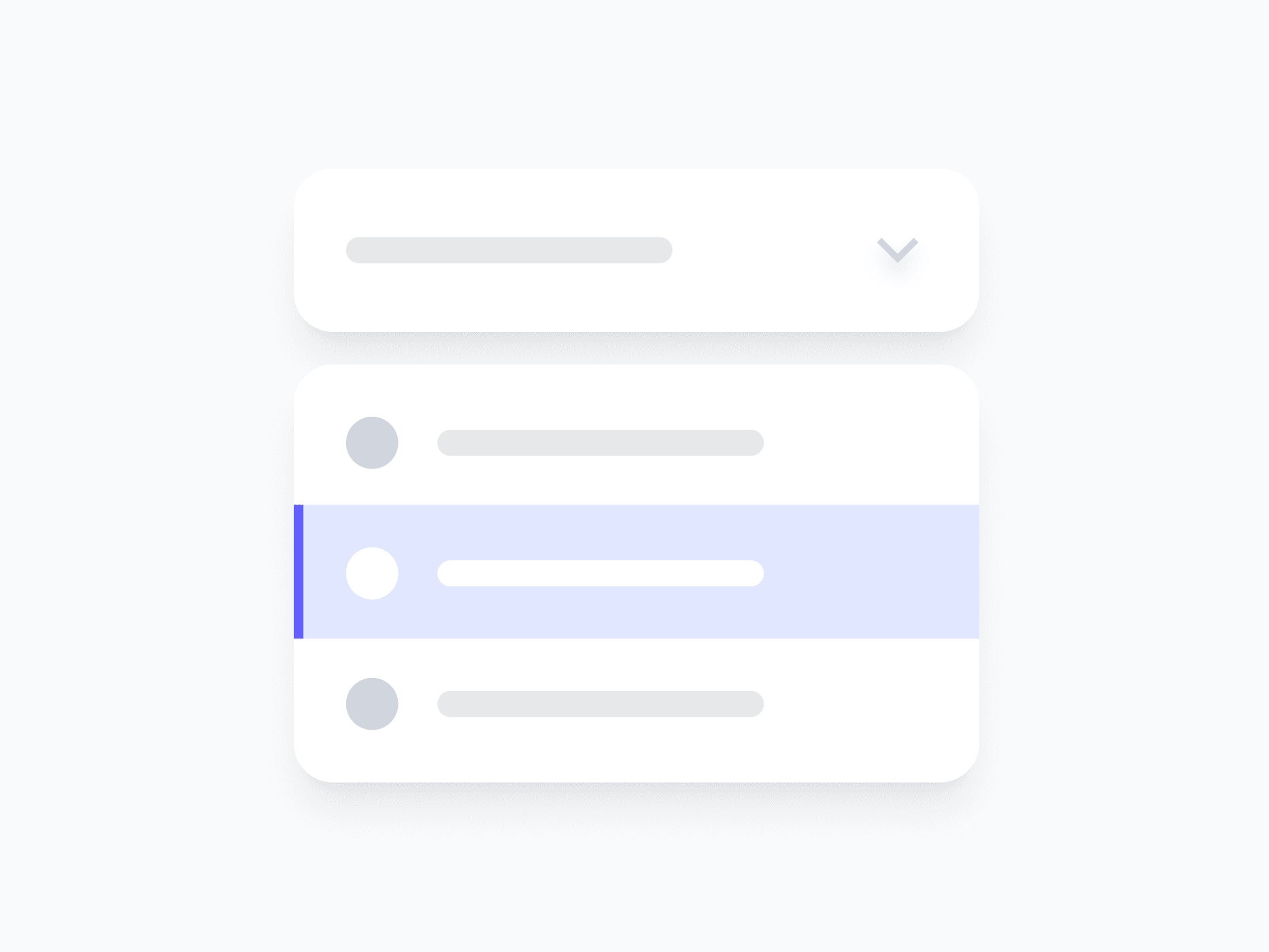
Select Field is a dropdown selection component built for every choice context, from plain text options to crypto assets, country flags, file types, and more. Each of the 8 variants ships with the right leading visual and layout for its data type, so the selector always matches the content it represents.
Figma Preview
When should you use them?
Use a select when a user chooses one option from a list that's too long for radios or visible buttons, like a country, a currency, or a file type. Pick the variant that matches your data so each option shows the right leading visual automatically.
How should you use them?
- Use a select for choosing from a longer list; use radios when there are only a few visible choices.
- Choose the variant that matches your data (Country, Crypto, File, and others) for the right leading visuals.
- Keep option labels short and scannable so users can find their choice quickly.
- Show the Loading state while options are being fetched.
- Use the Error state with a clear message when no valid option is selected.
- Keep the select keyboard-navigable, so users can open it and move through options without a mouse.
Stop deciding.
Start shipping.
The system is ready. Free to start, or get full access
at 50% off before the price goes up.
Start Free Now.
Upgrade whenever you need.


