
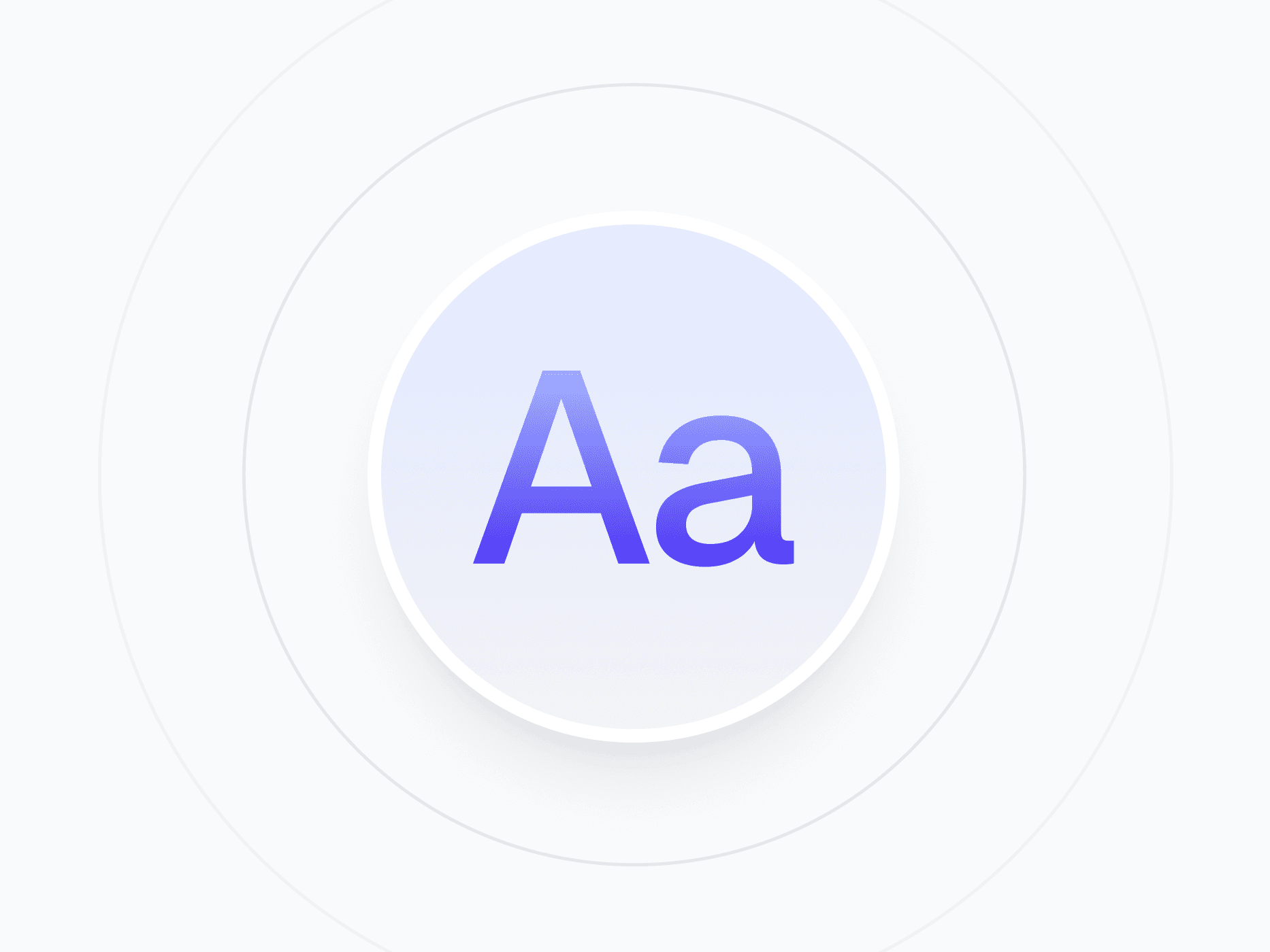
Typography
The typography foundation of Create UI. A responsive type scale with 7 semantic roles, multiple weights, and font variables that keep every text style in sync between Figma and React.
Overview
The Typography system defines how text looks and scales across every screen in Create UI. It's built on 7 semantic roles, each with responsive sizing and multiple weights, powered by font variables so the entire type hierarchy stays consistent between Figma and code.
Figma Preview
When should you use them?
Use the typography system any time you add text, from hero headlines to inline code snippets. Instead of setting font sizes and weights manually, apply a semantic role like Heading, Body, or Caption so your text scales correctly across devices and stays consistent everywhere.
How should you use them?
- Pick a semantic role (Display, Heading, Body, Paragraph, UI, Numeric, or Code) based on the text's purpose, not its size.
- Let responsive token bindings handle scaling across Desktop, Tablet, and Mobile automatically.
- Use the UI sub-roles for interface text: Control for labels, Overline for category markers, Caption for helper text.
- Swap the font family variable once to retheme every text style across the system instantly.
- Keep readable line lengths and sufficient contrast for accessibility.
Stop deciding.
Start shipping.
The system is ready. Free to start, or get full access
at 50% off before the price goes up.
Start Free Now.
Upgrade whenever you need.


