
The UI component library for Figma and React. Production-ready.
Every component ships in both Figma and React, with full variant coverage for size, state, style, and interaction. No gaps between design and production.


Foundations
The visual foundation of Create UI. Color system, typography, spacing, radius, and shadow styles. Everything components are built on.


Components
Buttons, inputs, modals, navigation, and more. Every UI component available in Figma and React.
![Button [Default]](/_next/image?url=%2Fwebsite%2Fcomponents-button.png&w=3840&q=75)
Button [Default]
![Button [App Store Badges]](/_next/image?url=%2Fwebsite%2Fcomponents-app-store-badge.png&w=3840&q=75)
Button [App Store Badges]
![Button [Group]](/_next/image?url=%2Fwebsite%2Fcomponents-button-group.png&w=3840&q=75)
Button [Group]
Free/Pro![Button [Close]](/_next/image?url=%2Fwebsite%2Fcomponents-close-button.png&w=3840&q=75)
Button [Close]
![Button [Text Link]](/_next/image?url=%2Fwebsite%2Fcomponents-text-link.png&w=3840&q=75)
Button [Text Link]
![Button [Social / SSO]](/_next/image?url=%2Fwebsite%2Fcomponents-button-social.png&w=3840&q=75)
Button [Social / SSO]
![Button [Floating Action Button]](/_next/image?url=%2Fwebsite%2Fcomponents-fab-button.png&w=3840&q=75)
Button [Floating Action Button]
Pro![Input [Text]](/_next/image?url=%2Fwebsite%2Fcomponents-input.png&w=3840&q=75)
Input [Text]
![Input [OTP]](/_next/image?url=%2Fwebsite%2Fcomponents-otp-input.png&w=3840&q=75)
Input [OTP]
![Input [Text Area]](/_next/image?url=%2Fwebsite%2Fcomponents-textarea.png&w=3840&q=75)
Input [Text Area]
![Input [Stepper / Number]](/_next/image?url=%2Fwebsite%2Fcomponents-stepper-number-input.png&w=3840&q=75)
Input [Stepper / Number]
Free/Pro![Input [Tag]](/_next/image?url=%2Fwebsite%2Fcomponents-input-tag.png&w=3840&q=75)
Input [Tag]
Pro
Checkbox
Checkbox Group

Radio
Radio Group

Switch

Switch Group
Select
Segmented Control

Slider
Free/Pro
File Upload
Pro
Dropzone

Breadcrumbs
Free/Pro
Pagination
Free/Pro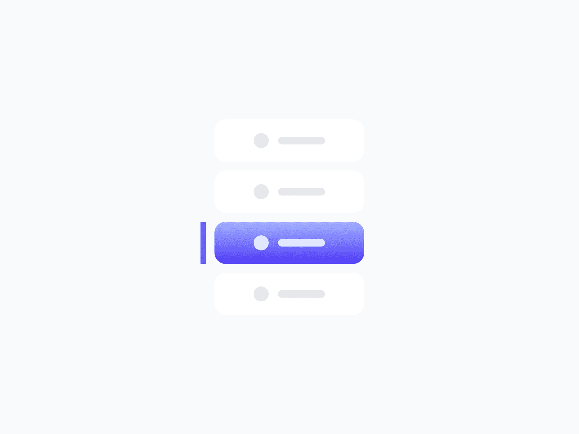
Tab Menu
Free/Pro
Header Navigation
Pro
Sidebar Navigation
Pro
Inline Alert

Toast / Snackbar
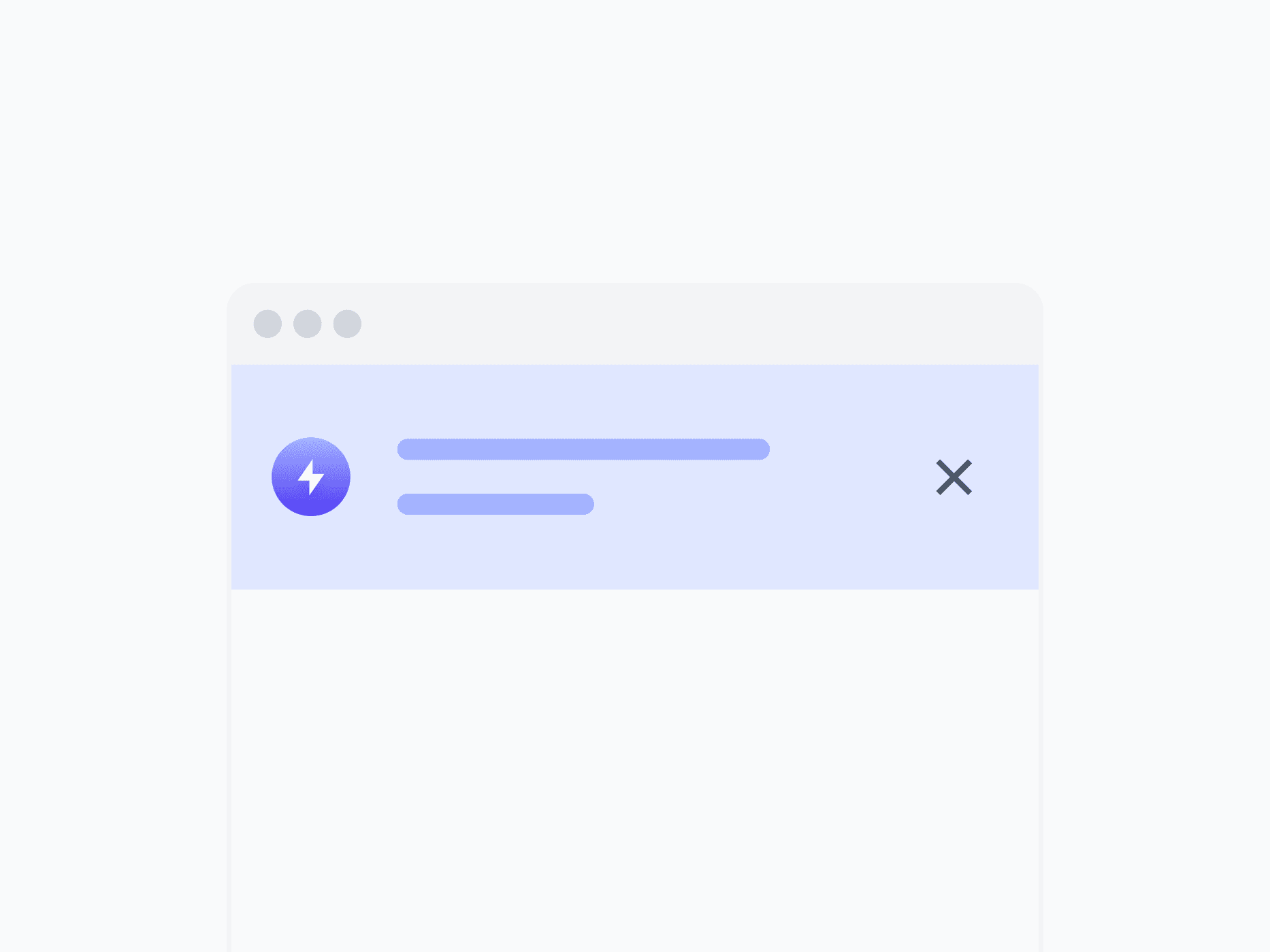
Alert Banner
Pro
Tooltip
![Popover [Rich Content]](/_next/image?url=%2Fwebsite%2Fcomponents-popover.png&w=3840&q=75)
Popover [Rich Content]
Pro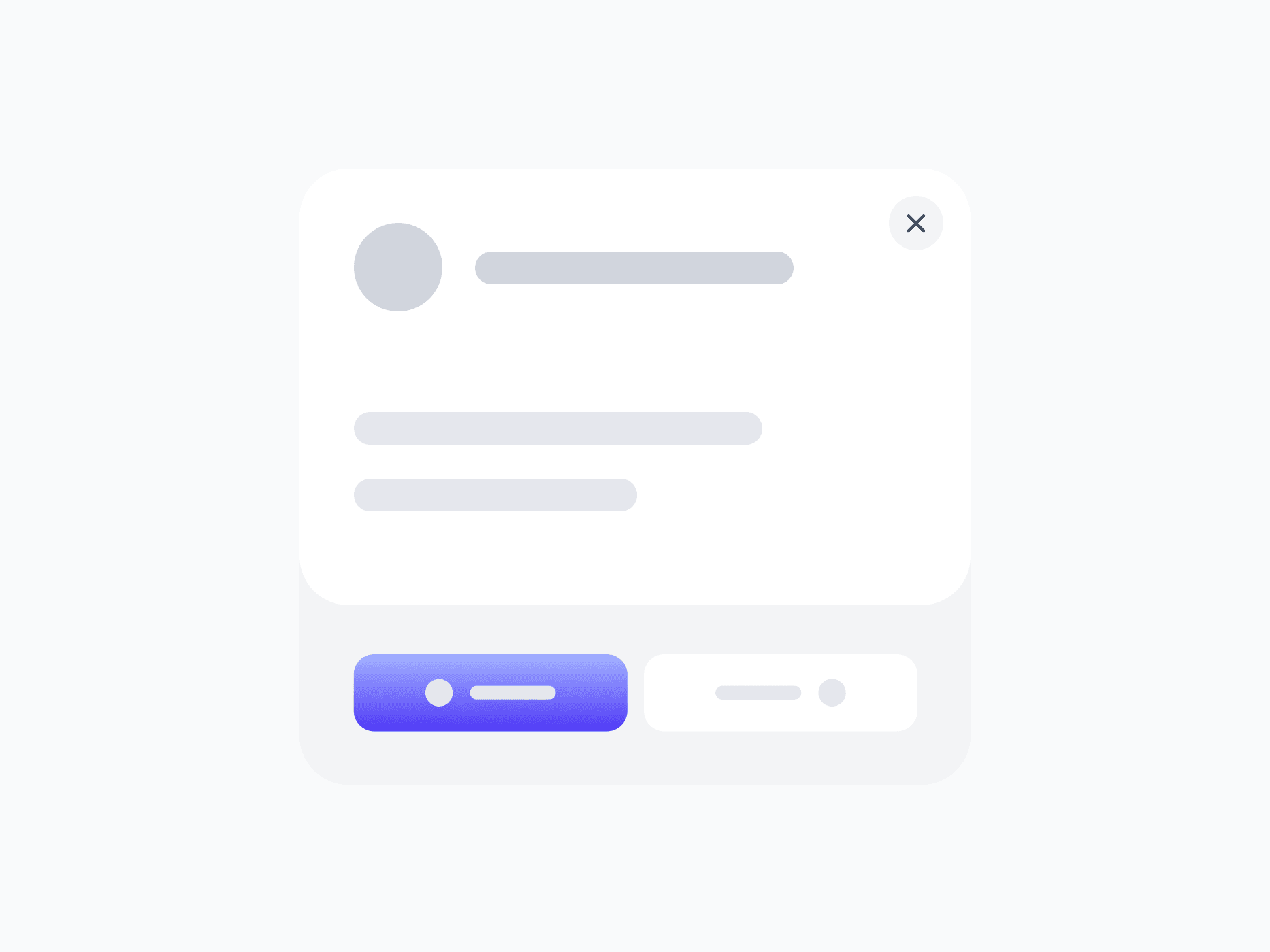
Modal / Dialog
Pro
Dropdown Menu
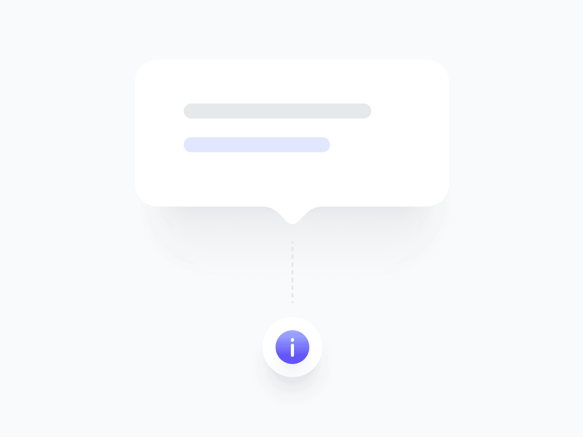
Info Tooltip
Pro
Command Menu
Pro
Rating
Pro
Chips
![Badge [Tag]](/_next/image?url=%2Fwebsite%2Fcomponents-badge.png&w=3840&q=75)
Badge [Tag]
Status Badge
Spinner - Loaders
Progress Indicators

Step Indicator
Free/Pro
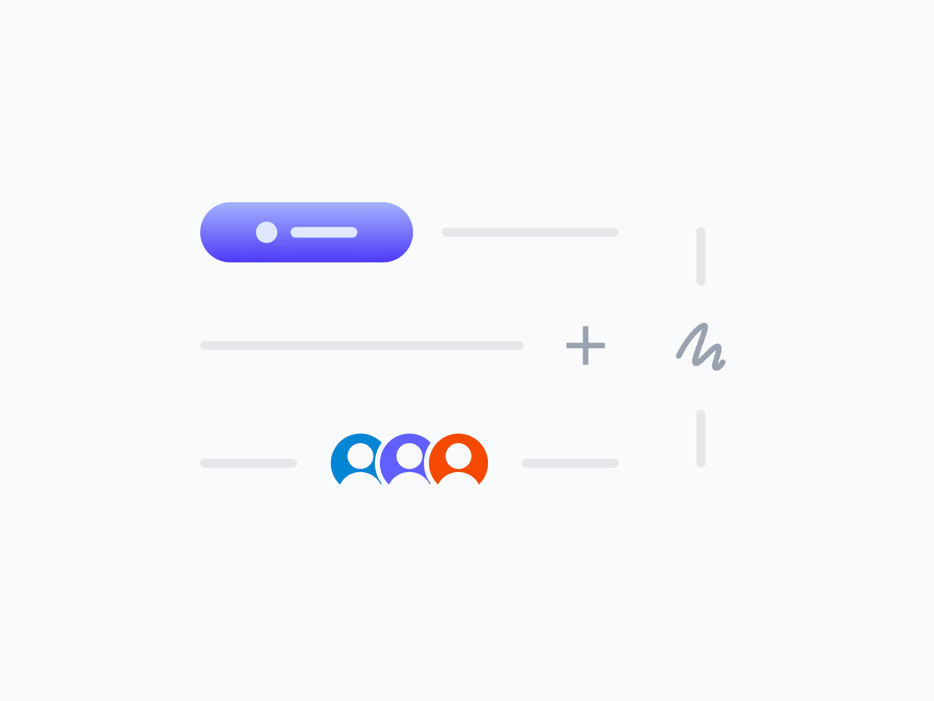
Avatar

Avatar Group
Content Divider (Separator)
Free/Pro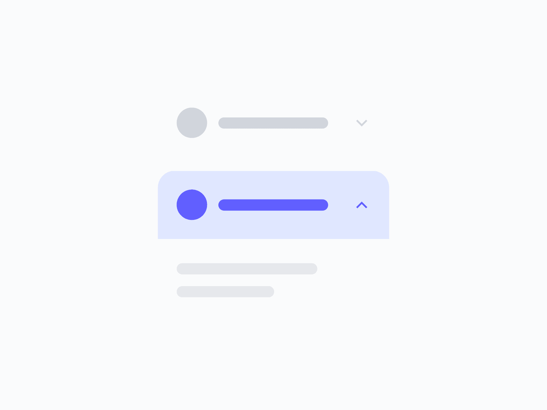
Accordion
Blog Contents
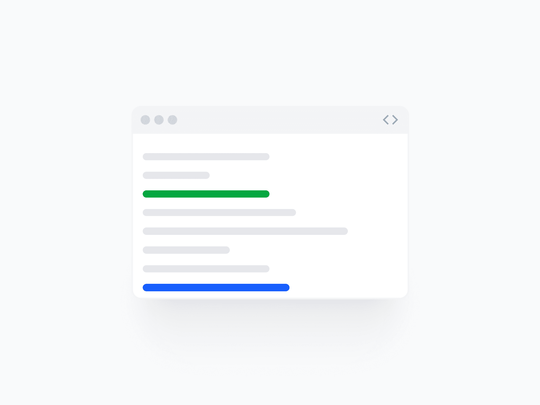
Code Block
Aspect Ratio

Scroll Bar

File Format
ProQuestions,
answered clearly.
Plans, pricing, licensing, updates, and technical questions, all answered in one place.
Still have questions?


The free version includes a selection of core React components, enough to evaluate the system and start building. It does not include the full Figma design system, the complete component library, design tokens, advanced variants, or Pro patterns. If you're building a real product and need the full system, all 65+ components, 16,800+ variants, and the Figma kit, you'll need a paid plan.
Stop deciding.
Start shipping.
The system is ready. Free to start, or get full access
at 50% off before the price goes up.
Start Free Now.
Upgrade whenever you need.