
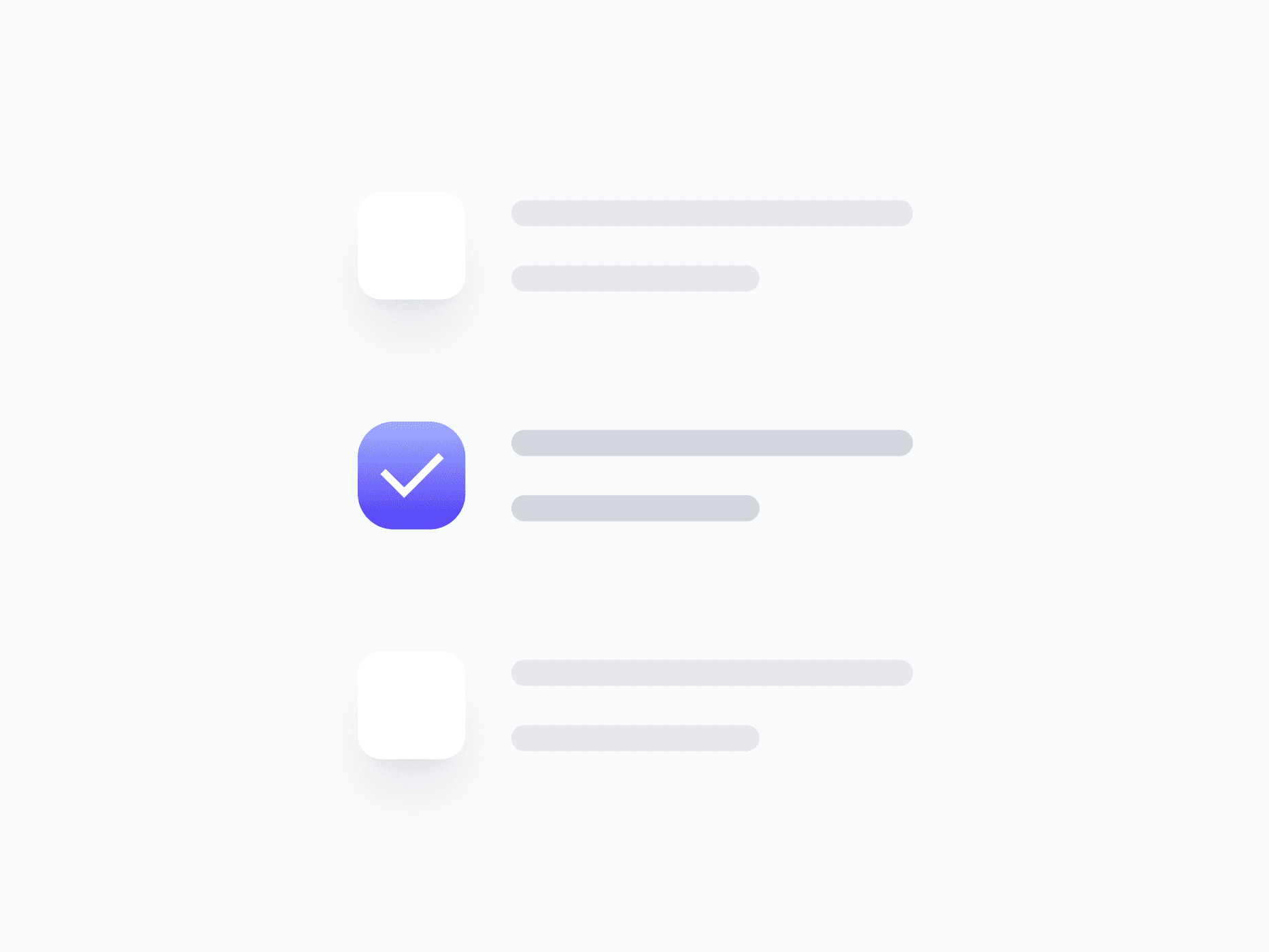
Checkbox Group
A fully composed checkbox unit that combines a checkbox with its label, badge, and text link. Checkbox Group handles placement, validation, and content visibility in one component, ready in Figma and React.
Overview
Checkbox Group combines a checkbox with its label, badge, and text link into a single cohesive unit. It handles placement, validation, and content visibility in one component, so you never have to manually align or sync individual pieces across every form. With 2 variants, 3 sizes, and flexible content toggles, it drops in ready to use.
Figma Preview
When should you use them?
Use a checkbox group whenever a checkbox needs more than a bare box, such as a labeled option with a badge, a terms checkbox with an inline link, or a list item that needs consistent alignment. It keeps the checkbox and its supporting content perfectly aligned without manual spacing.
How should you use them?
- Use it instead of assembling a checkbox, label, and link by hand, to keep alignment consistent.
- Choose Left or Right placement to match reading direction or platform convention.
- Toggle the text link on for options that need an inline link, like a terms-and-conditions row.
- Use the Danger variant to show validation errors directly on the option.
- Show the badge only when it adds meaning, like a 'New' or count indicator.
- Keep the full row clickable and keyboard-accessible for an easy target.
Stop deciding.
Start shipping.
The system is ready. Free to start, or get full access
at 50% off before the price goes up.
Start Free Now.
Upgrade whenever you need.


