
Shadows & Effects
The depth and effect foundation of Create UI. Named styles for shadows, component elevation, focus rings, blurs, and text shadows, all calibrated for light and dark mode and applied without manual values.
Overview
The Shadows & Effects system covers every kind of depth and emphasis in Create UI: elevation shadows, component shadows, focus rings, blurs, and text shadows. Each is a named style with calibrated light and dark variants, so you apply realistic depth from the right panel without touching manual values.
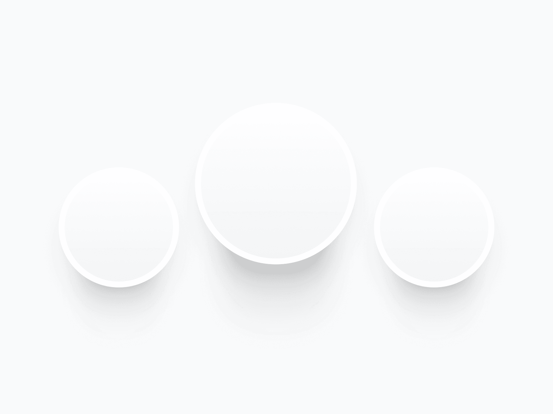
Figma Preview
When should you use them?
Use shadows and effects to communicate elevation, focus, and emphasis. Lift surfaces with elevation shadows, reinforce interactive elements with component shadows, signal keyboard focus with focus rings, soften overlays with blurs, and keep headlines readable on imagery with text shadows.
How should you use them?
- Use named elevation shadows (8 sizes, from a 1px lift to 35px layered depth) instead of manual values.
- Apply component shadows to buttons, inputs, and cards, with variants for Default, Hover, and Focused states.
- Add focus rings to interactive components for visible keyboard focus and accessibility.
- Choose Uniform blur for consistent softness, Progressive blur for directional depth on overlays.
- Pick the matching Light or Dark variant so depth stays legible on every background.
Stop deciding.
Start shipping.
The system is ready. Free to start, or get full access
at 50% off before the price goes up.
Start Free Now.
Upgrade whenever you need.


