
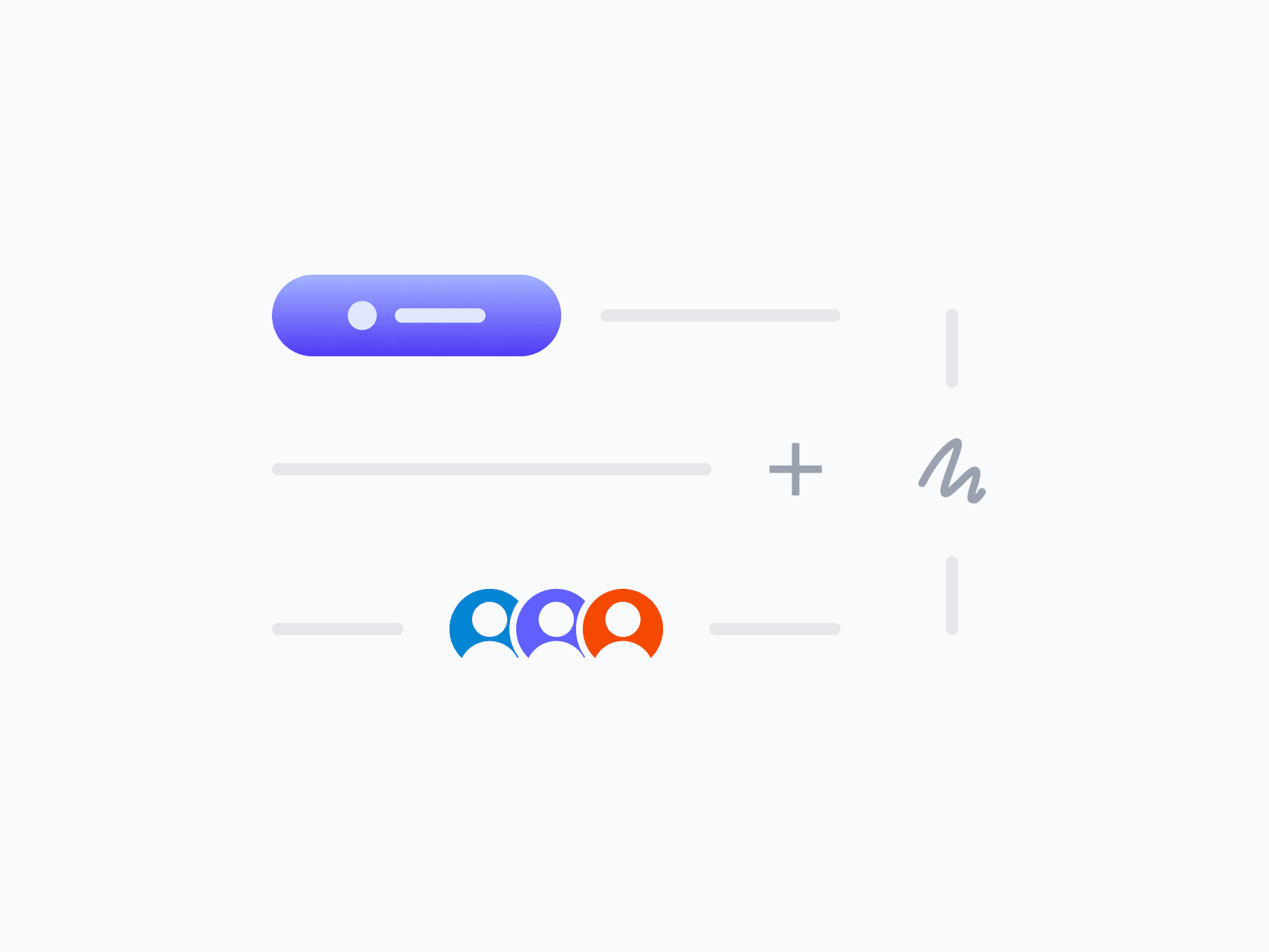
Content Divider (Separator)
Separates and organizes layout sections with clarity and purpose. Content Divider offers 7 variants that go beyond a plain line, embedding labels, icons, badges, and actions, ready in Figma and React.
Overview
Content Divider separates and organizes layout sections with clarity and purpose. Its 7 content variants go beyond a plain line, embedding actions, labels, icons, badges, and avatar groups directly into the divider to create section headers, add inline controls, and communicate context at the structural boundaries of your layout.
Figma Preview
When should you use them?
Use a content divider to separate distinct sections of a layout and make the structure easier to scan, like splitting a settings page into groups, or marking an 'OR' between two options. Use a content variant when the boundary also needs a label, an action, or context.
How should you use them?
- Use a divider to separate meaningful sections, not to decorate or break up every element.
- Use the plain Line variant for simple separation, and content variants when the boundary needs a label or action.
- Use Horizontal to split stacked sections and Vertical to separate side-by-side columns.
- Align embedded content (Start, Center, End) to match the layout's rhythm.
- Keep dividers subtle so they organize without competing with the content.
- Use a semantic separator role so screen readers recognize the structural boundary.
Stop deciding.
Start shipping.
The system is ready. Free to start, or get full access
at 50% off before the price goes up.
Start Free Now.
Upgrade whenever you need.


