
Aspect Ratio
A versatile container that maintains a consistent width-to-height ratio for any content inside it. Aspect Ratio offers 13 preset ratios, from square to cinematic, ready in Figma and React.
Overview
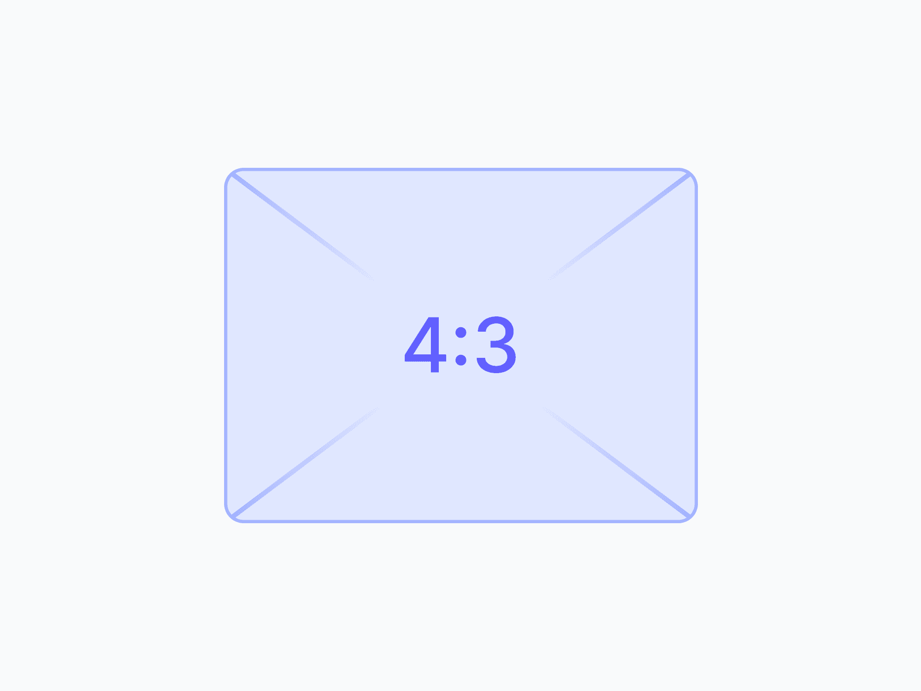
Aspect Ratio is a versatile container that maintains a consistent width-to-height ratio for any content placed inside it. Its 13 preset ratios cover every common use case, from square avatars and social media posts to cinematic banners and portrait stories, keeping media perfectly proportioned across breakpoints and devices.
Figma Preview
When should you use them?
Use an aspect ratio container to keep media proportioned and prevent layout shift, like images, video embeds, thumbnails, or social cards. It reserves the right space before content loads, so the layout stays stable instead of jumping as media appears.
How should you use them?
- Wrap images, video, and embeds in an aspect ratio container to keep them proportioned.
- Choose the preset that matches the content: 16:9 for video, 1:1 for avatars, 9:16 for stories.
- Use it to prevent layout shift, since the space is reserved before content loads.
- Let the container scale responsively rather than setting fixed pixel dimensions.
- Make sure content fills the container without distortion, cropping if needed.
- Keep meaningful images described with alt text for screen readers.
Stop deciding.
Start shipping.
The system is ready. Free to start, or get full access
at 50% off before the price goes up.
Start Free Now.
Upgrade whenever you need.


