
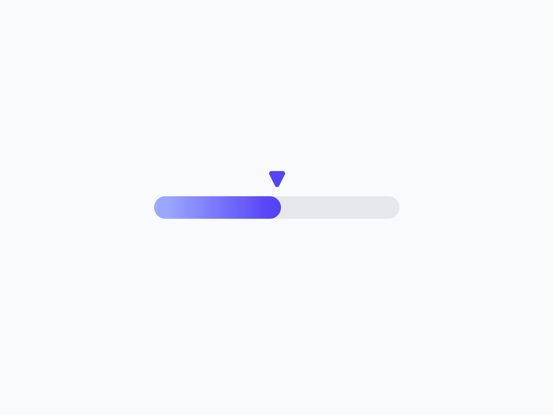
Progress Indicators
Determinate indicators that visualize operation progress as a circle or a linear bar. Progress Indicators include Progress Circle and Progress Line, with multiple shapes and sizes, ready in Figma and React.
Overview
Progress Indicators visualize the progress of an ongoing operation or task as a percentage. The set includes a circular Progress Circle for compact, focal placements and a horizontal Progress Line for inline and full-width bars. Both come in multiple shapes and sizes, with full light and dark mode coverage.
Figma Preview
When should you use them?
Use a progress indicator when you can show how far along a task is, like a file upload, a multi-step form, or a completion state. Choose Progress Circle for a compact, circular form, and Progress Line for a horizontal bar. Use a spinner instead when the wait is indeterminate.
How should you use them?
- Use a progress indicator for determinate progress; use a spinner when you can't show a percentage.
- Choose the Circle for compact or focal placements, and the Line for inline or full-width bars.
- Match the variant to context (Success on completion, Danger when an operation fails).
- Pair it with a label or percentage when the exact value matters.
- Animate progress smoothly so changes are easy to follow.
- Provide an accessible value so screen readers can announce the progress.
Stop deciding.
Start shipping.
The system is ready. Free to start, or get full access
at 50% off before the price goes up.
Start Free Now.
Upgrade whenever you need.


