
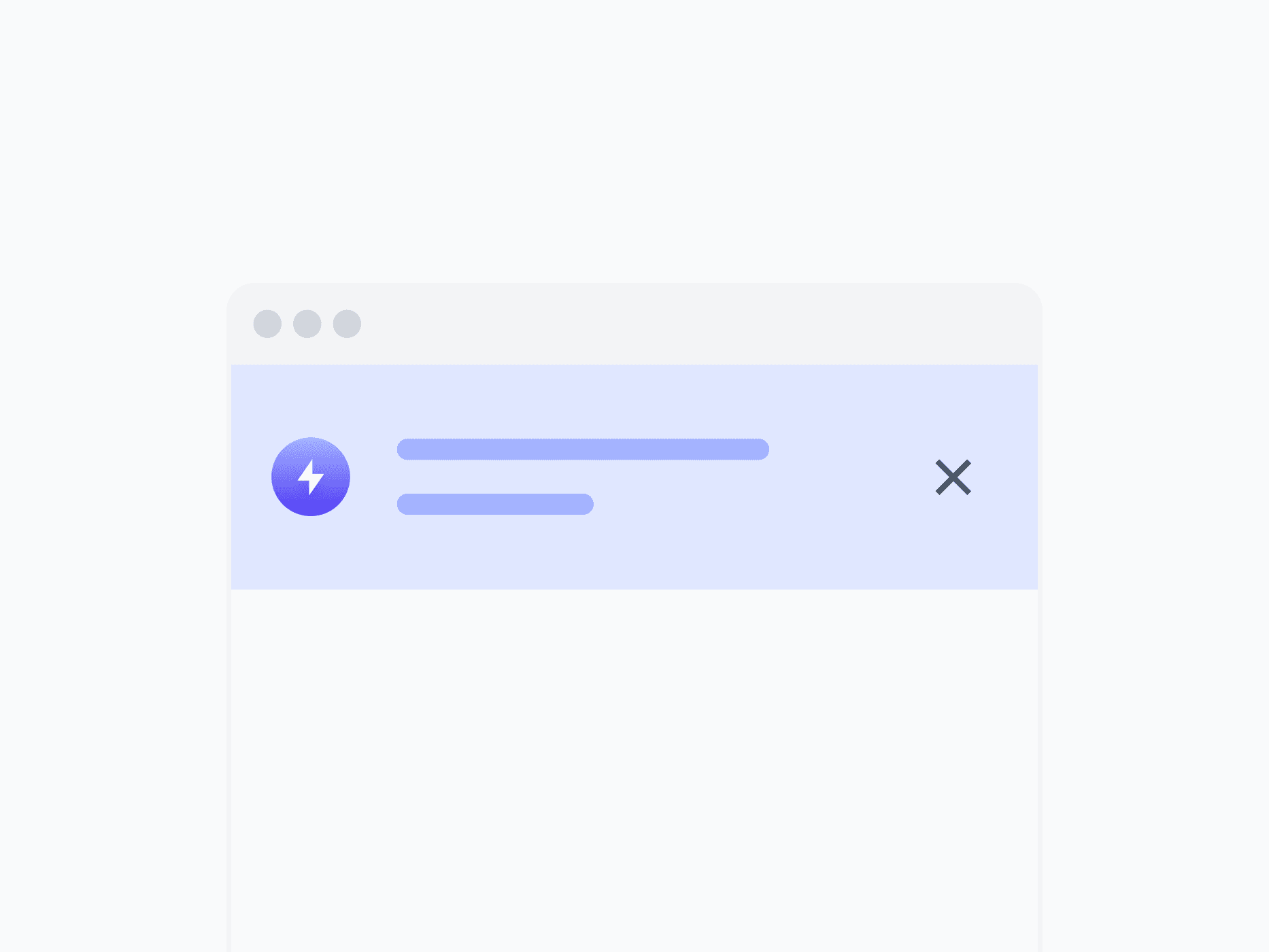
Alert Banner
System-wide announcements, critical warnings, and persistent status messages at the page or application level. Alert Banner spans the full layout width, with 7 variants and 4 appearances, ready in Figma and React.
Overview
Alert Banner delivers system-wide announcements, critical warnings, and persistent status messages at the page or application level. Unlike Inline Alert and Toast, it spans the full layout width to command attention for messages that require acknowledgment before users continue. With 7 variants, 4 appearances, and 2 directions, it covers every broadcast notification context.
Figma Preview
When should you use them?
Use an alert banner for high-level announcements that apply to the whole page or app, like scheduled maintenance, a trial expiring, or a system outage. Use an inline alert when feedback is tied to a specific section, and a toast for brief, temporary confirmations.
How should you use them?
- Use an alert banner for app-wide broadcasts; use an inline alert for section-level feedback and a toast for brief confirmations.
- Place it at the top of the page or app so it's seen before users continue.
- Match the variant to urgency (Danger for outages, Warning for expiring states, Info for announcements).
- Use Horizontal for concise broadcasts, Vertical for longer messages with actions.
- Make it dismissible unless acknowledgment is required, and avoid stacking multiple banners.
- Use color, an icon, and clear text together so the message is accessible to everyone.
Stop deciding.
Start shipping.
The system is ready. Free to start, or get full access
at 50% off before the price goes up.
Start Free Now.
Upgrade whenever you need.


