
Tab Menu
Organizes content into switchable sections within a single view. Tab Menu offers 7 layout variants, from horizontal tabs to vertical sidebar menus, built from Tab Item components, ready in Figma and React.
Overview
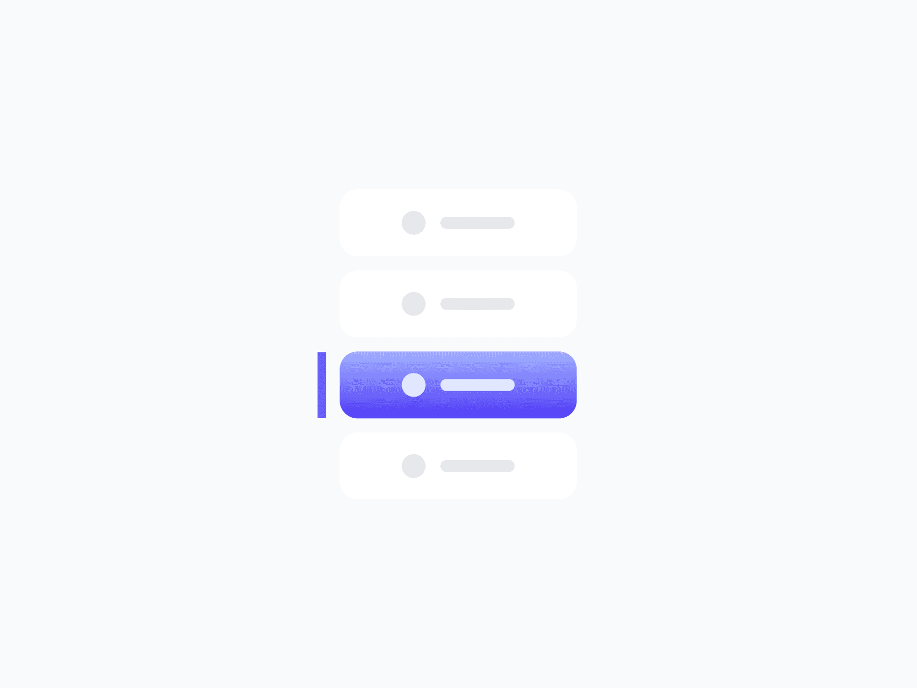
Tab Menu organizes content into switchable sections within a single view. Its 7 layout variants cover every orientation and indicator style, from horizontal button tabs and bottom-indicator navigation bars to vertical sidebar menus. Built from the Tab Item component, every item supports icons, badges, and status badges with full state coverage.
Figma Preview
When should you use them?
Use a tab menu to let users switch between related sections of content in the same view, like Overview, Activity, and Settings on a profile, or panels in a dashboard. Use a segmented control instead for compact mode toggles, and a dropdown menu when options should stay hidden until opened.
How should you use them?
- Use tabs to switch between content sections; use a segmented control for compact mode toggles.
- Keep tab labels short and clear so users can predict what each section holds.
- Show the active tab clearly so users always know which section they're viewing.
- Use a horizontal layout for page-level sections and a vertical layout for sidebar navigation.
- Add badges or status badges to a tab only when they add meaningful signal.
- Keep tabs keyboard-navigable with arrow keys and mark the active tab for screen readers.
Stop deciding.
Start shipping.
The system is ready. Free to start, or get full access
at 50% off before the price goes up.
Start Free Now.
Upgrade whenever you need.


