
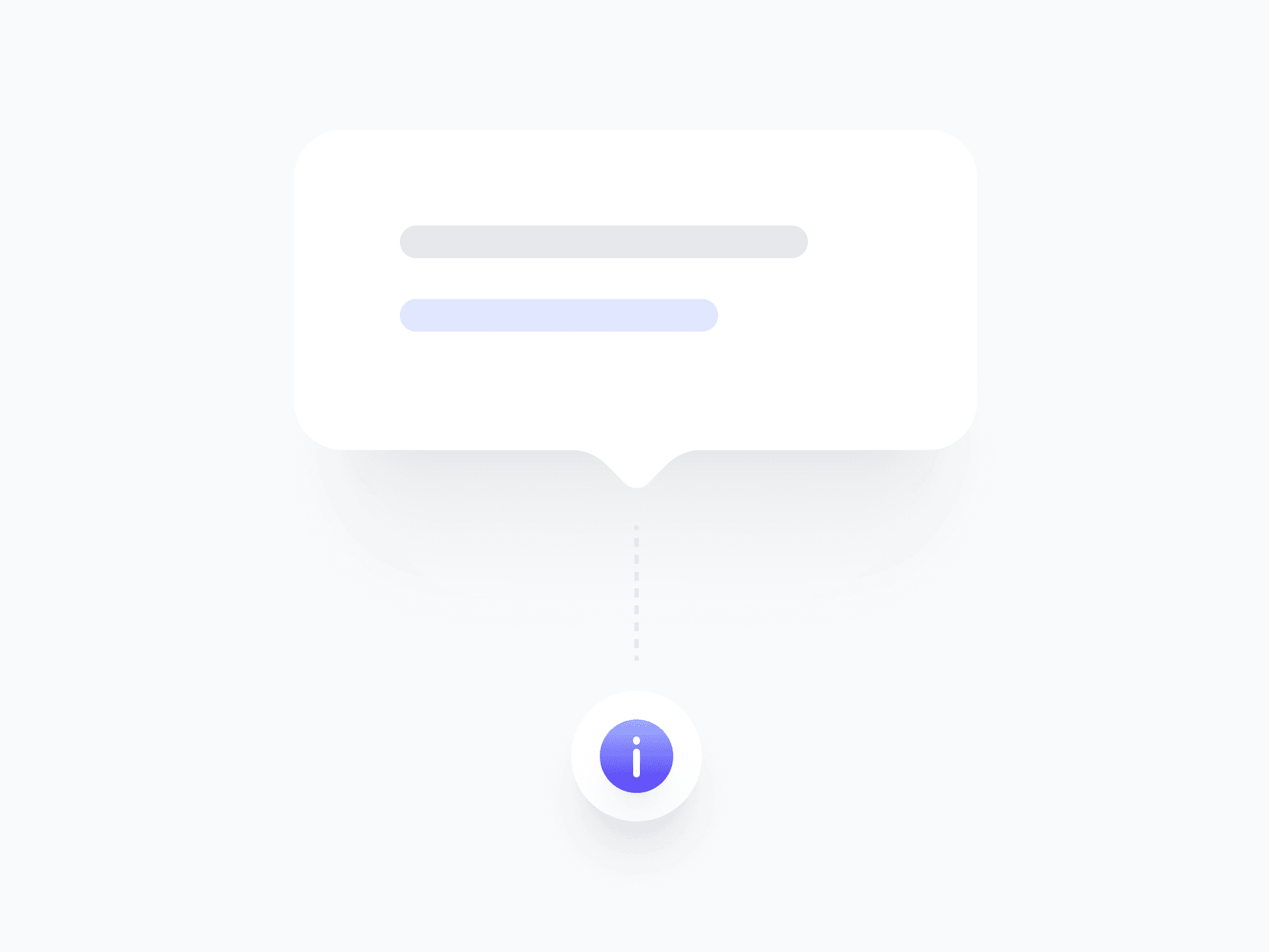
Info Tooltip
An expanded tooltip for contextual explanations that need more than a single line. Info Tooltip uses Figma's Slot feature to accept any component as its trigger, with 5 variants and flexible placement, ready in Figma and React.
Overview
Info Tooltip is an expanded tooltip for contextual explanations that need more than a single line. Powered by Figma's native Slot feature, it accepts any component as its trigger, an icon, button, badge, or custom element. For one-line hints use Tooltip, and for rich content with images or actions use Popover.
Figma Preview
When should you use them?
Use an info tooltip when a hint needs more than one line but doesn't require images, actions, or structured layout, like explaining a setting, clarifying a term, or adding context to a label. Bind it to a clear trigger, such as an info icon next to the element it explains.
How should you use them?
- Use an info tooltip for multi-line explanations; use Tooltip for one-liners and Popover for rich content.
- Bind it to a clear trigger, like an info icon, so users know help is available.
- Use the alignment options (Start, Center, End) to place the panel precisely against its trigger.
- Trigger on hover and focus so both mouse and keyboard users can reach it.
- Keep the explanation concise even though it can wrap, so it stays scannable.
- Make sure the content is reachable by keyboard and screen readers.
Stop deciding.
Start shipping.
The system is ready. Free to start, or get full access
at 50% off before the price goes up.
Start Free Now.
Upgrade whenever you need.


