

Slider
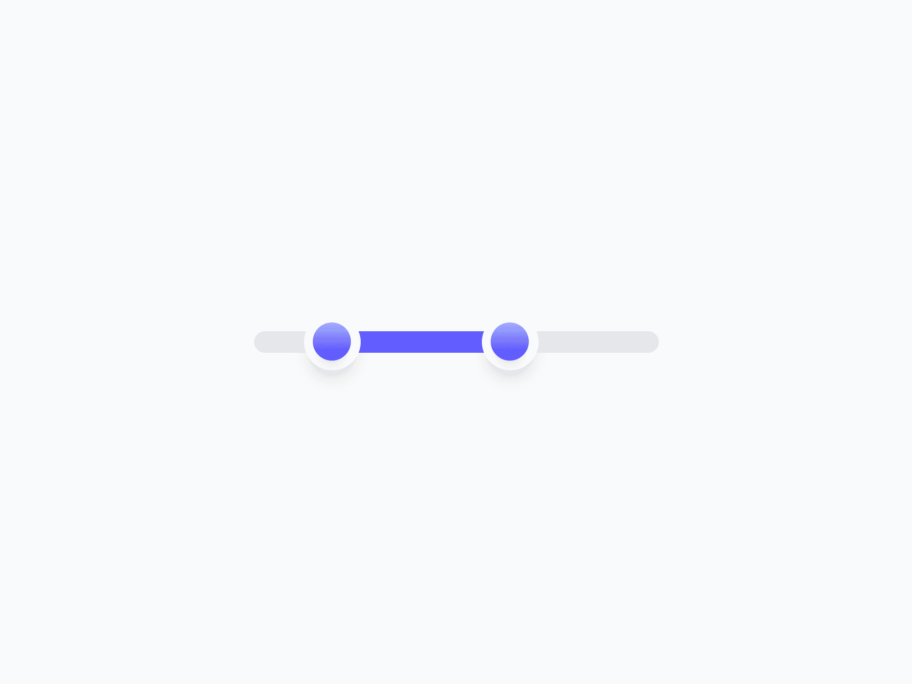
A continuous value selection component for adjusting numeric values within a defined range. Slider offers 2 variants, 3 sizes, single and range modes, plus bar and rail fills, ready in Figma and React.








Loved by 2,000+ users worldwide.
Overview
Slider is a continuous value selection component for adjusting numeric values within a defined range. Two shapes, three sizes, single and range modes, plus bar and rail fill styles make it a natural fit for volume controls, price filters, opacity settings, and any value picker where dragging feels more natural than typing a number.
Figma Preview
When should you use them?
Use a slider when someone needs to pick a value within a known range and direct manipulation feels more natural than typing, like volume, opacity, brightness, or a price filter. Use single mode for one value and range mode for a min and max. Reach for a number input or stepper instead when an exact, typed value matters more than dragging.
How should you use them?
- Use a slider for adjusting a value within a defined range; use a number input or stepper when precise entry matters more.
- Use single mode for one value and range mode for a min-max selection.
- Use bar fill for magnitude like volume or progress, and rail fill for discrete snap points or steps.
- Show the current value near the slider so the exact number is always clear.
- Match the variant to importance: Primary for prominent controls, Neutral for secondary or toolbar sliders.
- Make sure the slider is operable with arrow keys and has an accessible label and value for screen readers.
Questions,
answered clearly.
Plans, pricing, licensing, updates, and technical questions, all answered in one place.
Still have questions?


Your current plan is a one-time payment, no subscriptions, no recurring charges for what you buy today. Some future Create UI products (such as AI-powered features) may be offered as optional add-on subscriptions, but these are entirely separate and will never affect your existing purchase. What you buy now, you own permanently.

Stop deciding. Start shipping.
Install it today and your next screen takes an hour instead of a day. Keep rebuilding from scratch, and next quarter looks exactly like this one.
Start Free Now. Upgrade whenever you need.



