
Status Badge
A minimal indicator for communicating real-time state, availability, and classification at a glance. Status Badge is a pure color dot, no label or icon, with 11 variants, ready in Figma and React.
Overview
Status Badge is a minimal indicator component for communicating real-time state, availability, and contextual classification at a glance. With 11 semantic variants, it covers every system status, user presence, and categorical signal. Stripped down to a single color dot, with no label or icon, it pairs naturally with avatars, list items, cards, and data tables.
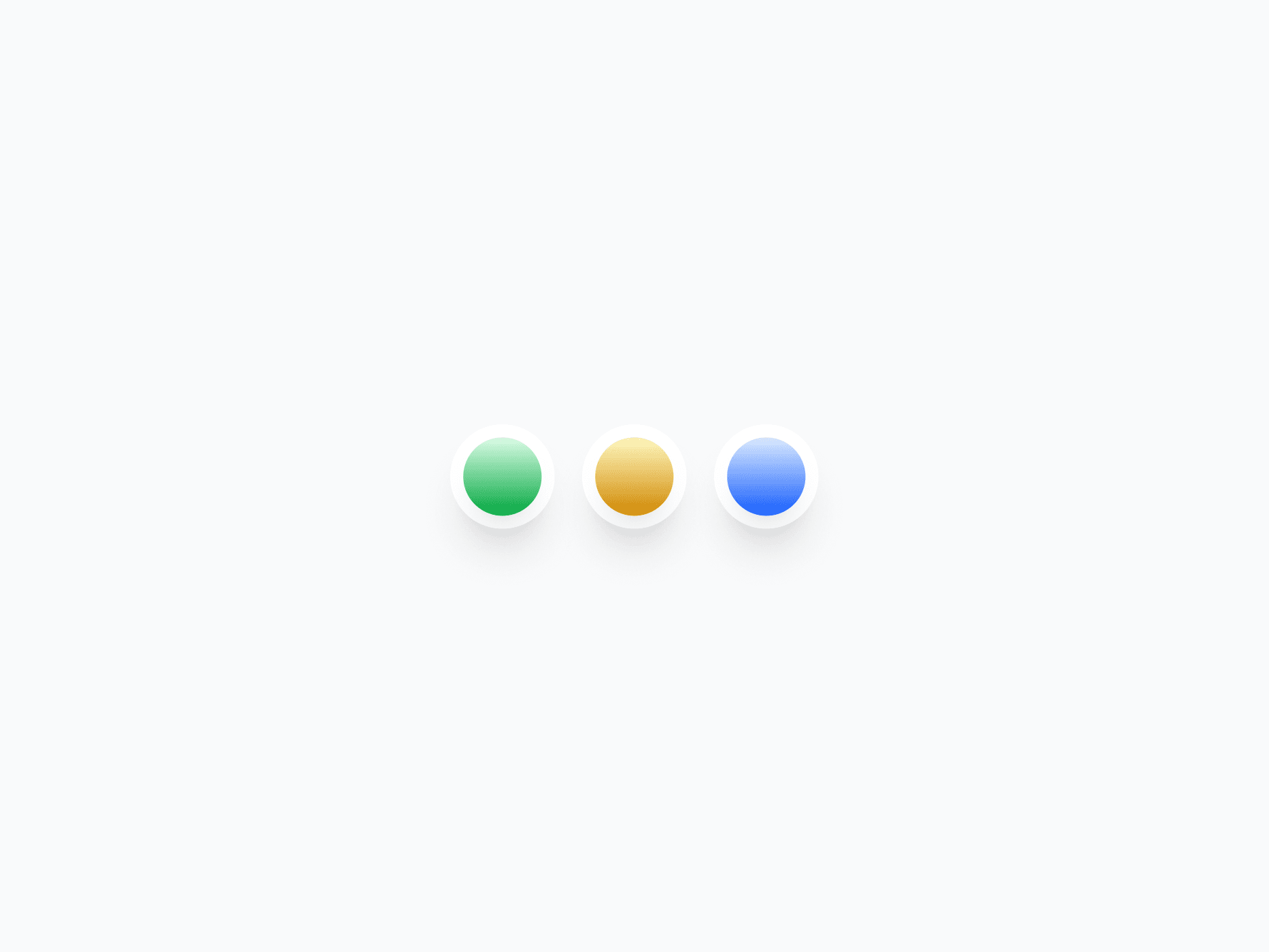
Figma Preview
When should you use them?
Use a status badge when a compact color dot can carry the full meaning, like an online or away indicator on an avatar, a status dot in a list, or a categorical marker in a table. When you need text, a count, or an icon, use Badge instead.
How should you use them?
- Use a status badge for pure status signals; use Badge when you need text, a count, or an icon.
- Place it where status is expected, like the corner of an avatar or the start of a list row.
- Match the variant to meaning (Success for online, Away for idle, Danger for errors).
- Pair it with a text label or tooltip so the status isn't communicated by color alone.
- Keep it small and consistent so it reads as a signal, not a decoration.
- Make sure the status is available to screen readers, since a color dot alone isn't accessible.
Stop deciding.
Start shipping.
The system is ready. Free to start, or get full access
at 50% off before the price goes up.
Start Free Now.
Upgrade whenever you need.


