








Picking a React UI library in 2026 comes down to three questions. Do you want the code in your repo or in node_modules? Do your designers need a matching Figma file? And does your product need AI interfaces like chat, prompt input and tool calls? This list is organized around those questions.
- Create UI
- shadcn/ui
- MUI
- HeroUI
- Untitled UI React
- Mantine
- Ant Design
- Chakra UI
- React Aria
- Base UI
- Radix UI
- Flowbite React
- daisyUI
- Magic UI
- Aceternity UI
Quick comparison
1. Create UI: React components and a Figma design system in sync
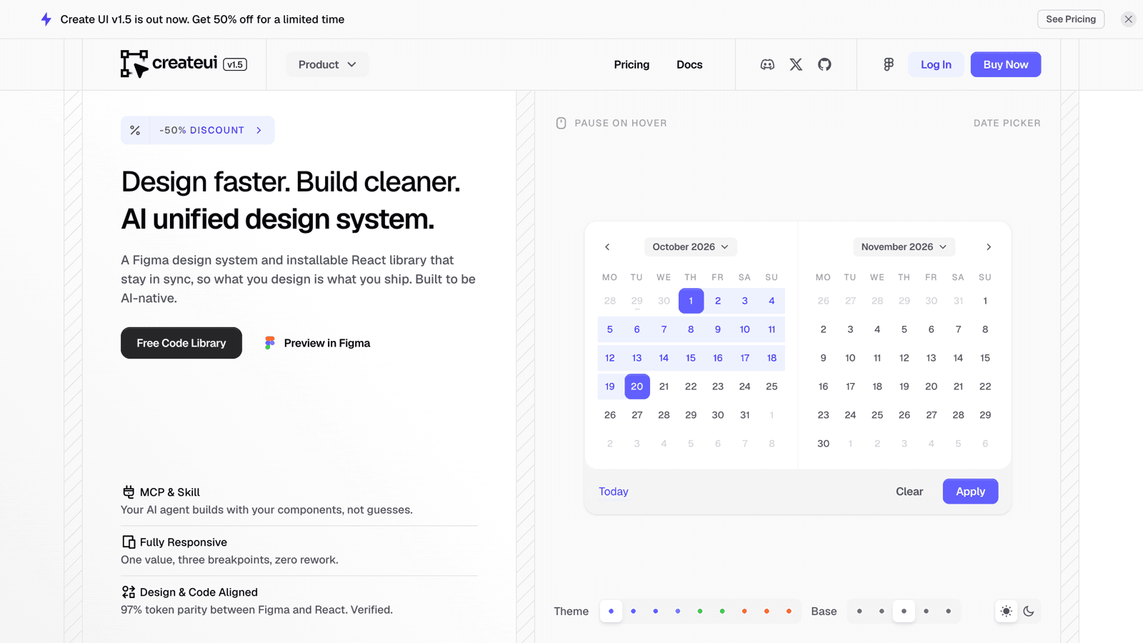
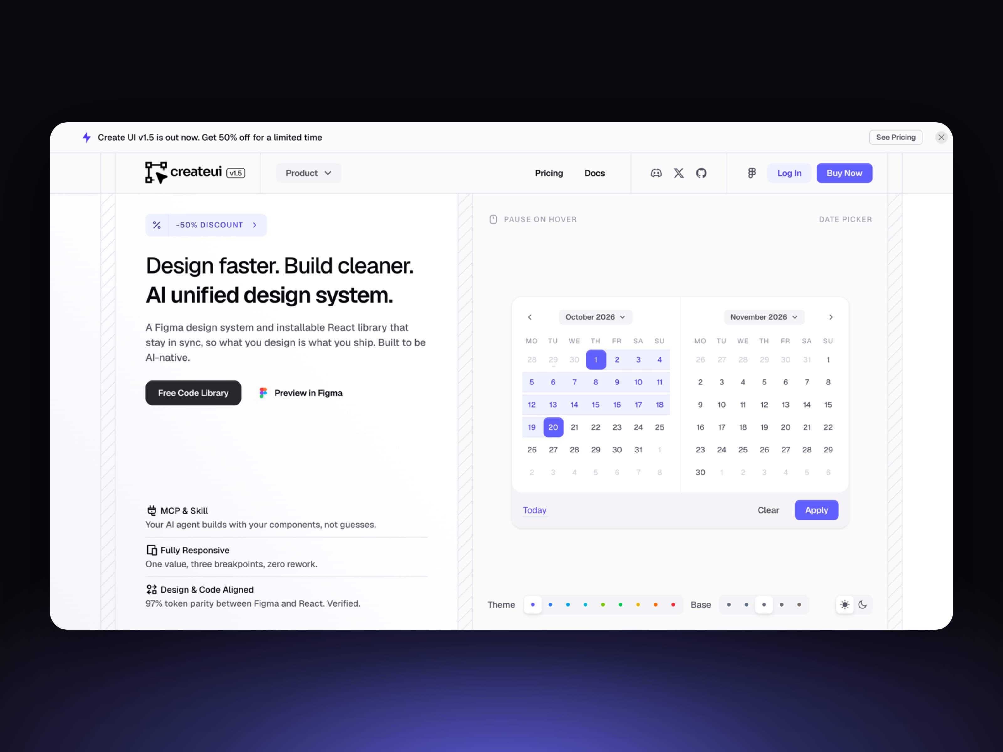
Yes, it's our own pick, so judge it on the facts. Create UI is a React and Tailwind CSS v4 component library that ships with a Figma design system under the exact same names, tokens and variants. Components install into your repo with one command, the way shadcn/ui does, so you own and edit the code. The difference is that you start from a finished, designed system instead of a blank base.
You get 80+ components, 73 ready-made blocks (login and sign-up pages, navbars, sidebars, dropdown menus, modals, section headers), and 950+ variables and styles that drive light and dark mode. It also includes a full set of AI chat components: chat messages, a prompt input with attachments, tool calls, sources, chain of thought and streaming markdown.
It's built for AI coding agents too. An MCP server and an agent skill let Claude Code, Cursor or Codex read every component's props and examples, so they build with your components instead of guessing.
Best for: product teams where designers and developers need the same system, and anyone building an AI product in React. The core library is free; Pro adds the full Figma system, Pro components and blocks.
2. shadcn/ui: the open-code default
shadcn/ui isn't a dependency. Its CLI copies components into your project, and the registry format it introduced is now how many libraries distribute code. In 2026 it added a choice of primitive bases (Base UI by default, Radix or React Aria), new styles, and its own chat components. It's free and MIT licensed. There's no official Figma kit, only community ones.
Best for: teams that want to build their own design system on a solid, popular starting point.
3. MUI: the enterprise heavyweight
🔗 mui.com
MUI implements Material Design and is one of the most used React libraries. The free core is MIT; the advanced MUI X data grid and pickers are paid. It has an official MCP server and an official Figma kit (paid), and MUI X Chat is available as an early preview.
Best for: enterprise dashboards that need a serious data grid.
4. HeroUI: polished defaults on React Aria
HeroUI (formerly NextUI) pairs React Aria accessibility with Tailwind CSS v4 styling and good-looking defaults. Version 3 covers both web and React Native. It ships as an npm package, has a Figma kit, and offers an MCP server for AI tools.
Best for: teams that want attractive components out of the box with strong accessibility.
5. Untitled UI React: the code side of a huge Figma kit
Untitled UI is best known for its very large Figma UI kit. Untitled UI React brings that design language to code with Tailwind CSS v4 and React Aria, with a free tier and a paid PRO tier that adds thousands of components, sections and page examples.
Best for: design-led teams already working in the Untitled UI Figma kit.
6. Mantine: batteries included, without Tailwind
Mantine ships 120+ components and 70+ hooks, including strong form and date packages, styled with plain CSS modules so there's no runtime styling cost. It's free and MIT licensed, with an MCP server and llms.txt for AI tools.
Best for: full-featured apps that want everything in one npm package and don't use Tailwind.
7. Ant Design: built for data-dense apps
Ant Design is an enterprise design language from Ant Group, strongest in tables, forms and admin screens. Its separate Ant Design X package is one of the most complete AI interface kits available, with chat bubbles, a sender, conversations and thought chains.
Best for: back-office and admin apps with lots of data.
8. Chakra UI: style props and tokens
Chakra UI is a themable system built around design tokens and recipes, with a style-props API many developers enjoy. Version 3 builds on Ark UI. The core is free; Chakra UI Pro sells blocks and templates.
Best for: teams that like styling components through props.
9. React Aria: accessibility-first primitives
Adobe's React Aria offers hooks and 50+ unstyled components with the most thorough accessibility and internationalization support on this list. You bring the styles; starter kits exist for Tailwind CSS and plain CSS.
Best for: accessibility-critical products and design-system authors.
10. Base UI: the new headless foundation
Base UI comes from the creators of Radix, Material UI and Floating UI. It provides unstyled, accessible primitives and is now the default base for shadcn/ui. Free and MIT licensed.
Best for: building your own component library on a modern headless base.
11. Radix UI: the primitives everyone built on
Radix Primitives are the unstyled, accessible components that a large share of today's React libraries were built on, Create UI included. Radix Themes adds a styled layer. Both are free and MIT licensed.
Best for: low-level control over behavior and accessibility.
12. Flowbite React: importable Tailwind components
Flowbite React wraps the Flowbite Tailwind CSS ecosystem in React components you import from npm. Flowbite Pro adds hundreds of components and a Figma design system, and its MCP server includes a Figma-to-code tool.
Best for: Tailwind teams that prefer an npm package over copied code.
13. daisyUI: Tailwind class names for any stack
daisyUI is a Tailwind plugin that adds semantic class names like btn and card, with dozens of themes. It works with any framework because it's pure CSS, so interactive behavior and accessibility are up to you. A Figma library is sold separately.
Best for: fast prototypes and projects that aren't React-only.
14. Magic UI: motion for shadcn apps
Magic UI offers 150+ free animated components built with Tailwind CSS and Motion, designed to sit next to shadcn/ui. A paid Pro tier adds templates.
Best for: adding animated sections to a shadcn-based app or landing page.
15. Aceternity UI: effects for landing pages
Aceternity UI focuses on eye-catching effects and animated sections, with a free component set and paid blocks and templates. Components are copy-paste or installed through the shadcn CLI.
Best for: marketing pages that need to stand out.
How to choose
- You want the code in your repo: Create UI or shadcn/ui. Pick Create UI if you also want a matching Figma design system and ready blocks. Comparing options to shadcn/ui specifically? See the best shadcn/ui alternatives.
- You want one npm package: MUI, Mantine, HeroUI or Chakra UI.
- You're building your own system from scratch: Base UI, React Aria or Radix.
- You're building an AI product: Create UI, shadcn/ui or Ant Design X all include chat components.
- Designers and developers share one source of truth: choose a library with an official Figma kit that matches the code, like Create UI or Untitled UI.
Whatever you pick, check two things before committing: how recently the library shipped a release, and whether your AI coding tools can read its docs through llms.txt or an MCP server. In 2026, that second point decides how much of your UI an agent can build correctly.